Neymar Tattoos: Meanings & Design Breakdown

A tattoo-studio analysis of Neymar's 30+ documented tattoos — family tributes, faith marks, and artist Adão Rosa — with pain estimates.

Neymar Tattoos: Meanings & Design Breakdown

Neymar Jr. is, by almost every count, the most heavily tattooed superstar in world football. Public tattoo directories list more than 30 documented pieces (some catalogues push the number toward 46), and the large majority were done by a single artist — Adão Rosa of the Nautica studio in Brazil. That single-artist through-line is what makes his body a coherent collection rather than a random scatter, and it is exactly the kind of detail a generic “celebrity tattoos” list skips.

This is not a gossip roundup. It is a design analysis: what he has, why it is placed where it is, who drew it, and what a similar piece would take to execute well. Every fact below is sourced from public tattoo reporting (linked at the end).
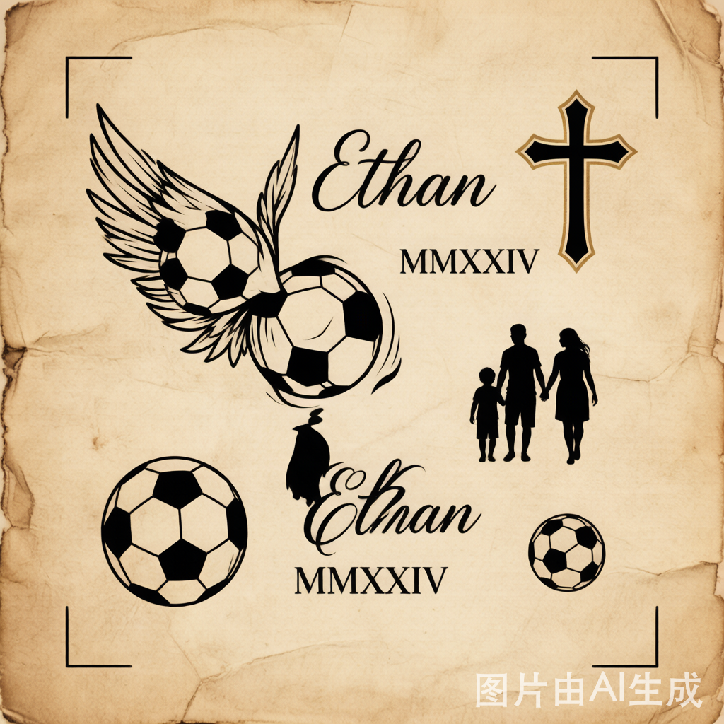
Neymar tattoo theme mood board — family, faith, and football motifs rendered as blackwork editorial art

1. Player snapshot

Full nameNeymar da Silva Santos Júnior
Documented tattoos30+ (catalogues range 30–46)
Primary artistAdão Rosa (Nautica studio, Brazil)
Dominant themesSon & family, faith, football milestones
Dominant styleBlackwork script + fine-line realism

2. Themed tattoo inventory

The collection splits cleanly into three intentions:

  • Family tribute — the name Davi Lucca (his son, born 2011), his sister Rafaela, and his mother Nadine appear as script and portrait pieces. His father, Neymar Santos Sr., is also marked.
  • Faith marks — repeated crosses and the phrase “Que Deus me abençoe” (“May God bless me”), a piece he had done during a mid-season trip to Brazil with Adão Rosa.
  • Football identity — jersey numbers, a soccer ball, and milestone dates sit alongside the personal work, anchoring the collection to his career.

3. Meaning & cultural analysis

Unlike players who treat ink as decoration, Neymar’s set reads as a visual autobiography built almost entirely from his inner circle. The concentration of family names — son, sister, mother, father — is unusual in its completeness; most athletes mark a partner or child, not the whole household.

The single-artist pattern matters for the analysis: because Adão Rosa executed most pieces, the line weight, shading density, and script grammar stay consistent across years. That is why the body reads as designed rather than accumulated.

4. Design breakdown

The faith-and-family chest work is a good specimen to dissect. A competent recreation follows three layers:
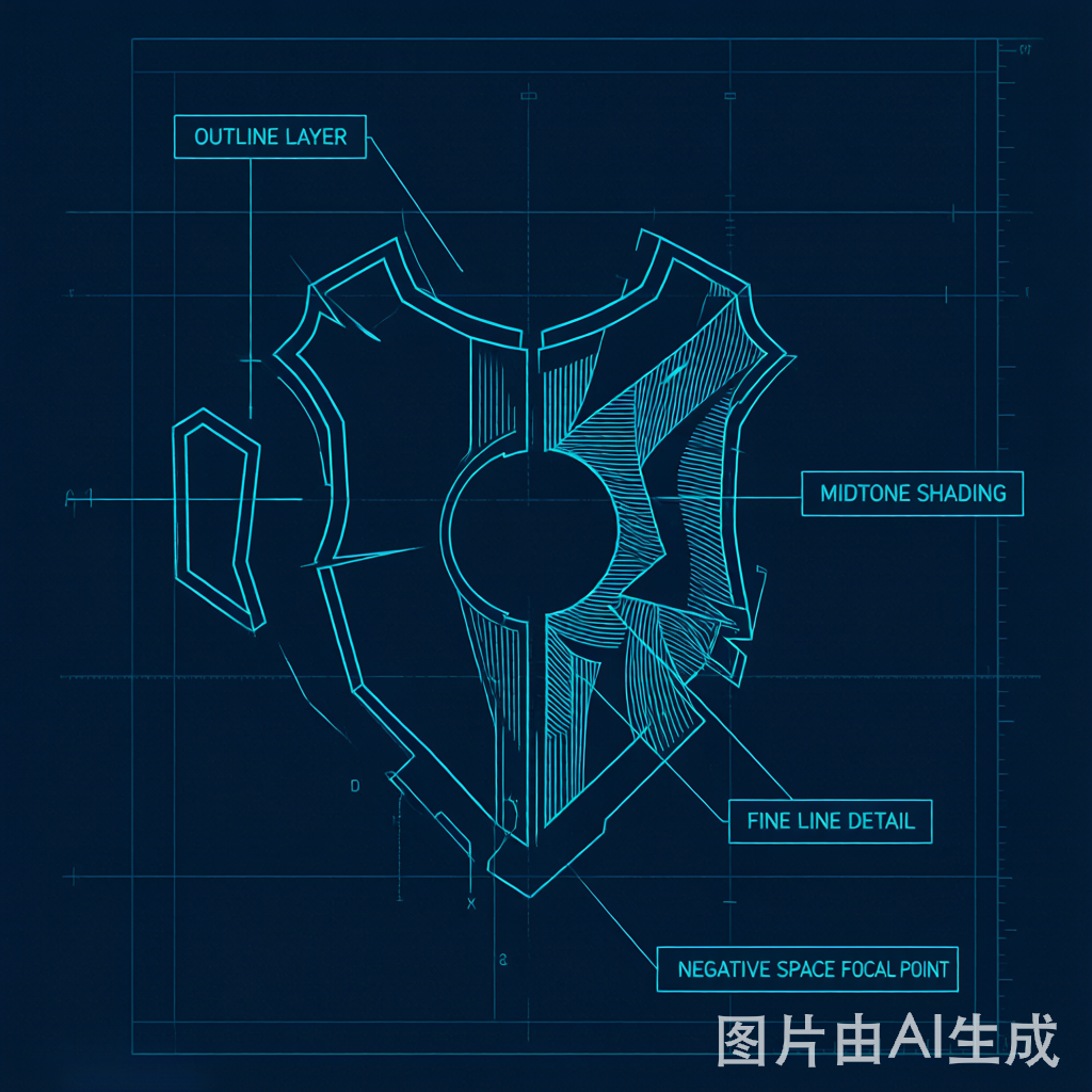
Technical design breakdown of a faith-and-family chest piece — exploded layers with callouts

  1. Bold outline layer — the script and cross骨架, set first so later shading has an anchor.
  2. Midtone shading — packed black gradients that give the piece weight without losing the negative space around the names.
  3. Fine-line detail — drop shadows and serif flourishes on the lettering, the step that separates a custom name piece from a flash-sheet default.

5. Placement map

ZoneWhat sits there
ChestFaith script, crosses, family names
Arms / forearmSon’s name, football motifs
Back / sideLarger milestone and tribute work

The chest-and-forearm concentration keeps the most personal marks visible in short-sleeve kit — a deliberate choice for someone whose “why” is family.

6. Time & pain analysis

A single name-script + cross chest piece of this density typically runs 3–5 hours in one or two sittings. A full blackwork sleeve of comparable coverage (where Neymar is headed) is 15–25+ hours across multiple sessions. Chest and inner-forearm rank mid-to-high on the pain scale; the sternum and rib-adjacent edges are the sharp end.

7. Editorial POV: the “single-artist” lesson

The takeaway for anyone planning a meaningful collection: coherence beats volume. Neymar’s set works because one artist’s hand runs through all of it. If you start with a story and keep one studio on the work, the pieces age as a set instead of a collage. That is the principle we build every design recommendation on — translate the story first, then draw.

8. Try it yourself

Want a family-tribute piece that reads like a set rather than a list?

9. Sources

Facts cross-checked against public tattoo reporting:

  • Body Art Guru — Neymar Jr’s tattoos and meanings
  • Tattoofilter — Neymar’s tattoos (Adão Rosa / Nautica studio)
  • IntotheSkinTattoos — What Do Neymar Tattoos Mean
  • ForksInnTavern — How Many Tattoos Does Neymar Have (Que Deus me abençoe)

Illustration note: the images on this page are interpretive editorial renderings created by MyInk, not photographs of the athlete. Analysis is our own; facts are linked to their sources.

Design Your Own Tattoo with AI

Turn any idea into a custom tattoo design in seconds. 10 styles, instant preview, free to start.

How to Use an AI Tattoo Preview Before You Book

MyInk is most useful when the output is treated as a planning reference, not a finished tattoo appointment file. Start with the idea you want to test, choose a style that has a real tattoo tradition behind it, then review whether the design can survive on skin at the size and placement you have in mind.

A strong tattoo preview should have one clear subject, readable contrast, and enough negative space for the design to age. Tiny lettering, hairline detail, crowded symbols, soft watercolor edges, and low-contrast color combinations can look beautiful on screen while becoming hard to read after healing and years of sun exposure.

Placement changes the design. A forearm can carry vertical compositions and readable symbols. Ribs and chest placements need more attention to pain, breathing movement, and body curvature. Fingers, hands, and wrists fade faster because the skin moves, washes, and rubs more often. The preview should help you see those tradeoffs before you pay a deposit.

Use the generator to create directions, then narrow to one or two realistic options. Save the prompt, style, placement, and reference image. That record gives your artist a clearer starting point than a folder of unrelated screenshots and helps prevent last-minute design confusion at the consultation.

An artist still needs to redraw, resize, and adapt the concept. Tattooing is not the same as printing an image on skin. Line weight, stencil clarity, needle grouping, skin tone, body movement, and healing all affect the final result. Treat any AI image as a brief for discussion, not a file to copy without judgment.

Be especially careful with memorial, cultural, religious, medical, or partner-name tattoo ideas. Those designs carry meaning beyond aesthetics, so the right workflow includes a pause: check the spelling, symbolism, cultural context, and long-term emotional fit before turning a preview into a permanent mark.

If a page only gives you a pretty image, it has not answered the important question. A useful tattoo planning page should explain who the idea suits, where it works, what might age poorly, what to ask an artist, and when a safer variation would be smarter.

Before booking, compare the design at phone size, full screen, and roughly the real size on your body. If the main shape disappears when small, simplify it. If the design relies on fragile detail, make it larger or choose a bolder style. If the meaning feels unclear, revise the concept before you involve an artist.

Best fit

Early tattoo ideation, style comparison, placement preview, cover-up exploration, memorial concept drafting, and preparing a clearer brief for an artist.

Poor fit

Copying another artist's work, replacing professional stencil preparation, guessing cultural meaning, or choosing a permanent tattoo from a single unreviewed image.

Before using

Check meaning, size, placement, contrast, aging risk, spelling, artist feasibility, and whether the design still feels right after a short waiting period.

Tattoo Planning Checklist

Decide the role of the tattoo first. A decorative piece can be judged by visual strength, fit, and longevity. A memorial or symbolic piece needs a second layer of review: spelling, dates, cultural meaning, emotional timing, and whether the symbol will still feel right when the current life moment has changed.

Check the design at real size. A beautiful full-screen image can fail when reduced to a three-inch wrist tattoo. If the subject, lettering, or secondary symbols become hard to read at actual size, the concept needs fewer details, heavier line weight, more open spacing, or a larger placement.

Compare the style with the body area. Traditional, blackwork, and neo-traditional designs usually tolerate aging better because they use stronger outlines and contrast. Fine-line, watercolor, and tiny geometric pieces can be excellent, but they need careful artist selection, realistic sizing, and acceptance that touch-ups may be part of ownership.

If you are planning a cover-up, be even more conservative. A cover-up has to solve the old tattoo's darkness, shape, and location before it can become a new design. The AI preview can help explore directions, but a cover-up artist must judge what is possible on the existing skin.

Use try-on previews to test placement honestly. Rotate, scale, and compare the idea on the intended body part. A design that looks balanced on a flat screen may distort around elbows, ribs, wrists, shoulders, knees, or fingers. The goal is not a perfect simulation; the goal is catching obvious placement mistakes early.

Before sending anything to an artist, write a short brief: subject, style, placement, approximate size, meaning, colors to use or avoid, and any symbols that must stay out. Add one or two generated references, not twenty. A tight brief gives the artist space to create original work while preserving your intent.

Avoid treating a generated image as proof that a tattoo is safe, culturally appropriate, or technically ready. Ask a professional about stencil clarity, line weight, skin tone, placement movement, and healing. The better the AI-assisted planning, the easier that expert conversation becomes.

If the design still feels right after a short waiting period, the next step is a real consultation. If it stops feeling right, that is a useful result too. The safest tattoo planning workflow helps you avoid weak ideas as much as it helps you find strong ones.

What Makes a Preview Useful

A useful preview answers a specific decision question. On an aging page, the question is whether contrast and line weight will survive. On a meaning page, the question is whether the symbol says the right thing without becoming too crowded. On a cover-up page, the question is whether the new design can realistically hide the old shape. On a pack page, the question is whether the concept is ready for an artist handoff.

The best pages therefore combine image exploration with judgment. They explain what the design is good for, where it may fail, what to ask an artist, and which details should be simplified before the tattoo becomes permanent. This is the difference between browsing tattoo images and actually preparing for a safer appointment.

If the output feels close, do not keep generating randomly. Change one variable at a time: style, placement, size, subject, color, or amount of detail. Comparing focused variations helps you see which part of the idea is strong and which part is creating risk.

A tattoo preview should also make refusal easier. If the design looks wrong on the body, feels too tied to a temporary emotion, depends on detail that will not age, or needs a placement you are not comfortable wearing, stop there. Avoiding the wrong tattoo is a successful planning outcome.

Pack and sample pages should be judged by handoff quality. A useful pack explains the concept, shows the intended style, gives the artist enough context, and leaves room for the artist to redraw instead of forcing a copied AI image. If the handoff would confuse a professional, the design is not ready yet.

Guide pages should help with the questions that sit around the image: what to prepare before a first tattoo, how to think about aftercare, when numbing cream needs artist approval, and how to avoid using pain or urgency as the only decision filter.

Sample pack pages should be especially concrete. They need to show what the buyer receives, how the files support an appointment, what still needs artist review, and when a user should keep refining before purchasing a handoff pack.

When a page helps someone ask a better question before the needle touches skin, it has done real work for both searchers and future clients.

That is why the planning pages emphasize clear briefs, readable designs, realistic sizing, and artist review instead of treating image generation as the final step.

If a sample cannot explain that handoff clearly, it should be revised before purchase.

Clear handoffs reduce appointment friction.

They also reduce revision waste later.