Lionel Messi Tattoos: Meanings & Design Analysis
A tattoo-studio analysis of Lionel Messi's 18 documented tattoos — family, faith, and football themes — with design breakdowns and a placement map.
Lionel Messi Tattoos: Meanings & Design Analysis
When the most-decorated footballer in history walks onto the pitch at the 2026 World Cup, his ink tells a story that has nothing to do with tactics. Messi’s body is a visual autobiography — roughly 18 documented tattoos (per a June 2026 tally by Body Art Guru and Technosports) spread across his arms, legs, and back. As a tattoo studio, we are not here to gossip. We are here to do what sports outlets can’t: break the work down as design — composition, placement, line weight, and the editorial judgment behind a tribute that actually ages well.
How we analyzed this. Every factual claim below is sourced from publicly reported documentation (SI, USA Today, Yahoo Sports, Body Art Guru — links in Sources). The illustrations in this article are original interpretive renderings created by MyInk, not photographs of the athlete. We analyze design, not paparazzi.
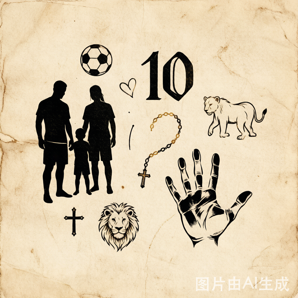
The Player Snapshot
| Subject | Lionel Messi (Argentina, No. 10) |
| Documented tattoos | ~18 (sources vary by 1–2 as new ink appears) |
| Dominant themes | Family · Faith · Football · Personal milestones |
| Largest piece | Right arm sleeve (shoulder down) |
| Why it matters for design | A near-perfect case study in cohesive tribute work vs. scattered impulse ink |
The Tattoo Inventory (by Theme)
1. Family — the backbone of the collection
This is where Messi’s ink is most deliberate, and where the documented detail is strongest:
- His three sons’ names and birthdates — Thiago, Mateo, and Ciro — inked on his right lower leg, just above the ankle (USA Today, June 2026).
- Eldest son Thiago’s handprints and name on the back of his left calf (Yahoo Sports, June 2026).
- His wife Antonella’s birthdate alongside the children’s on the left leg (Body Art Guru).
- His mother’s portrait on the left forearm — one of the few representational portrait pieces in the set.
2. Faith — Catholic iconography
Raised Catholic in Rosario, Messi carries overt religious imagery: a Jesus figure and a rosary/bead motif appear among the documented pieces. These are not decorative; in Argentine tattoo culture they signal continuity with family and community, not spectacle.
3. Football — the profession made permanent
- The No. 10 and related football symbolism anchor the “career” cluster.
- Reportedly, “MAS 91” — his initials (MAssiS) plus Antonella’s and his birth year (1991) — appears as a compact personal mark.
4. Personal milestones
Smaller script and symbol pieces fill gaps in the sleeve, a common technique to keep a growing collection visually continuous rather than bric-a-brac.
Meaning & Cultural Analysis
Why does a footballer — notoriously private about everything else — wear his inner life on his skin? Three vectors explain it:
- Tribute as identity. For athletes whose bodies are corporate assets, a family tattoo is one of the few marks that is not for the sponsor. It reads as authentically his.
- Catholic continuity. In Argentina, religious ink is communal, not controversial. It binds him to a visual language his fans already speak.
- The sleeve as a timeline. A right-arm sleeve that “begins at the shoulder” (USA Today) is a deliberate editorial decision: it grows downward over a career, each addition a chapter.
The design lesson for everyday clients: a tribute collection reads as intentional when it shares a constraint — same line weight, same palette, same negative-space rhythm. Messi’s works because the family cluster is geographically tight and thematically singular.
Design Breakdown (Original MyInk Diagram)
Below is our studio’s interpretive breakdown of how a cohesive family tribute tattoo is typically structured — the same logic that makes a scattered idea read as a single composition.
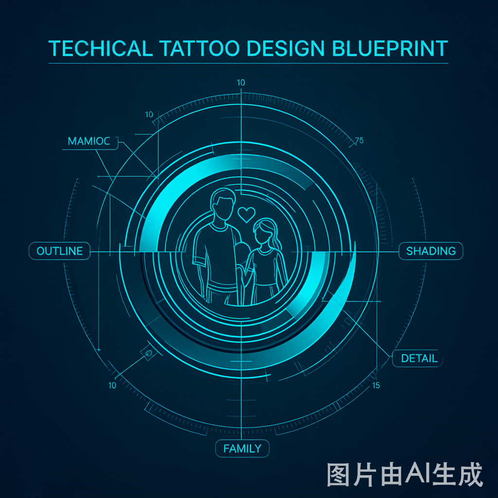
A well-built tribute, layer by layer:
- Outer outline — bold, confident, the “spine” of the piece. Thin outlines on a tribute read as timid.
- Midtone shading — gives the handprint or portrait dimension without muddying.
- Fine-line detailing — birthdates, names. This is where legibility lives or dies.
- Negative-space focal point — the deliberate un-inked area that makes the eye land on the subject.
Studio note: Most amateur tribute tattoos fail at layer 4. They fill every gap. A great tribute breathes.
Placement Map & Three-View Logic
Reading the documented placements as a composition:
- Right arm (shoulder → sleeve): the career/faith spine.
- Right lower leg (above ankle): the sons’ names + dates — high-visibility, low-pain entry point for the family cluster.
- Left calf (back): Thiago handprints — a “private” surface, chosen precisely because it isn’t seen on the pitch.
- Left forearm: the mother’s portrait — a public, declarative piece.
The logic is sound: public-facing skin carries declarative identity (mother, faith); hidden skin carries intimate tribute (son’s hands). That’s not accidental. It’s curation.
Time & Pain Analysis
We estimate, based on standard session math for the documented placements:
| Area | Approx. sessions | Pain (1–10) | Notes |
|---|---|---|---|
| Right arm sleeve | 6–10 | 4–6 | Outer arm is tolerable; inner bicep spikes |
| Lower leg / ankle | 1–2 | 5–7 | Bone-adjacent = sharper |
| Calf (back) | 1–2 | 3–4 | Fleshy, forgiving |
| Forearm portrait | 1–2 | 3–5 | Accessible, moderate |
Takeaway: a collection this size is a multi-year commitment, not a weekend project. Clients who try to compress it usually regret the cohesion.
MyInk Editorial: What Makes a Tribute “Good”
Most tribute tattoos we’re asked to fix share one flaw — they were designed as individual impulses, not a system. Messi’s works because:
- One theme per region. Family lives on the legs; career/faith on the arm. No cross-contamination.
- A consistent hand. Speculation aside, the visual continuity suggests a small number of artists over time — not a different studio per trip.
- Restraint on the face. Only one representational portrait (his mother). Everything else is symbolic. That restraint is what keeps it from looking like a sticker book.
If you want a tribute that ages like his, start with a single constraint — one style, one palette — and let the collection grow into it. Our Meaningful Tattoo Planner walks you through that framing before you ever sit in a chair.
Design Your Own
Messi’s ink is a masterclass in intentional tribute work. You don’t need 18 pieces to apply the logic — you need one clear constraint and a design that respects negative space.
- Sketch a family or milestone concept with our AI Tattoo Generator.
- See how a portrait or handprint reads on your own body with Virtual Try-On.
- Study the symbolism behind common choices in our Tattoo Meanings guide.
- Compare styles — from Minimalist to Realistic — before committing line weight.
Sources
- SI — Lionel Messi’s Tattoos: Meanings, Designs & Stories (June 2025)
- USA Today — Lionel Messi’s tattoos: deciphering the meaning (June 16, 2026)
- Yahoo Sports — Lionel Messi’s tattoos and the meaning behind his inks (June 17, 2026)
- Body Art Guru — Lionel Messi’s 18 Tattoos & Their Meanings (2026)
- Technosports — All 18 Lionel Messi Tattoos: Complete List (June 6, 2026)
Exact counts and placements vary slightly between outlets as new tattoos appear. This article analyzes publicly reported documentation as of July 2026 and is an original design commentary, not a reproduction of any photograph.
Explore More
- Ready to design a tribute that ages well? Try our AI Tattoo Generator to draft it in seconds.
- See it on your own skin first with Virtual Try-On.
- Browse the Tattoo Meaning Guide for symbol breakdowns.
- New to ink? Start with our First Tattoo Guide.
Preview on skin
Try this on your skin
Upload a photo and see the design placed on your own body before anything is permanent.
Try it on · 1 credit →
Free advisor
Create your own design
Describe one idea and the advisor shapes it into 4 genuinely different directions.
Open the studio — free to start →
The advisor is free. A round of 4 directions costs 4 credits — See plans — 8 free credits to start